King Bros. Limited is an independently owned Customs Brokerage and Ships Agency located in the beautiful port city of Victoria, BC. The company has been in operation since 1911, with the current owners maintaining the founders values of integrity, honesty, and professionalism.
I have been working with King Brothers for 16 years now years now – since 2008 – and have been fortunate enough to have been the only person to have ever worked on their online identity. I built their first website and have since rebranded the company and created every piece of their online presence, promotional materials and advertising since then.
Management have always briefed me properly and trusted me to provide them with the branding that I felt reflected who they are and what they do and with that, the entire marketing spectrum is very cohesive.
Plus, they really are great people. A pleasure to work with.
As an independent Ship’s Agency and Customs Brokerage firm, we recognized the need to improve our on-line presence, and to provide a better information portal for our clients.
In just one meeting, Steve was able to take our fledgling ideas and quickly provide a concept for our new site. Working with him over the course of the project was enjoyable and enlightening, and the finished product succeeds beyond our expectations. Beyond the design, Steve’s understanding of website analytics, and his drive to continuously improve results is a huge added benefit.
In conjunction with the new website, we also asked Steve to help us develop a corporate brand identity. As a 100 year old company, we felt it was time to re-assess our image and to project a more modern look. The time and effort, along with the attention to detail that Steve provided culminated in a comprehensive new look for our company involving logos, letterhead, and business cards.
We are now working with Steve as we venture into print advertising, and again, we are extremely pleased with his concepts and approach. This is a new frontier for our business, but we have no doubt Steve’s skills in marketing will benefit our company.
Steve has given our business an opportunity to grow and to reach new markets. We look forward to a long and successful working relationship in the coming years.
– Simon Smith. President. King Bros. Limited
The Website
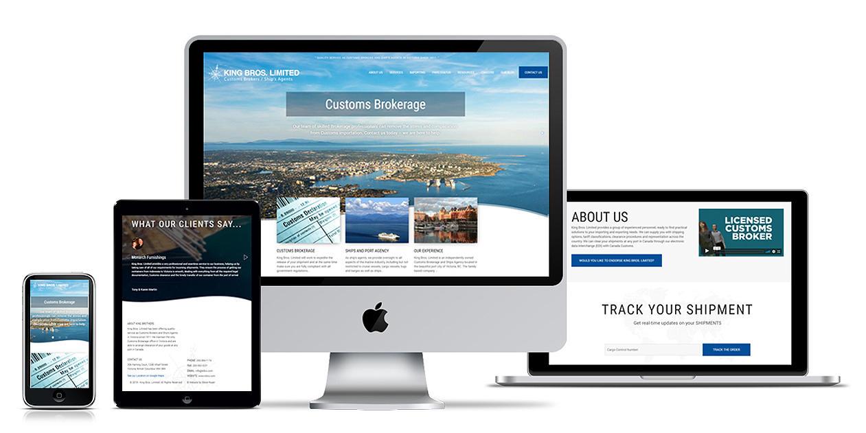
I was asked to refresh the website in 2018 and we chose the scroll option to simplify the site but we also spent considerable time getting the images right. This iteration represents the location much more effectively that past versions mostly thanks to the invent of drone photography, which brought down the costs of acquiring high quality aerials which we could not manage on earlier versions. We’re happy with this.
You can visit their website here >
The Integration of CARM
CARM stands for CBSA Assessment and Revenue Management project. It is a multi-year initiative that will transform the collection of duties and taxes for goods imported into Canada. ALL businesses importing commercial goods into Canada would need to have a CARM client portal account registered with CBSA. In the future, CARM will also require importers to post their own financial security with CBSA.
After this announcement by the Canadian Government, King Brothers took the initiative to launch a comprehensive communications campaign in order to assist their client base with this mandate.
We created a CARM Preparedness Checklist and sent out a comprehensive e-Newsletter plus added promotional reminders within the footers of all outgoing email.
You can visit their CARM Communications page here >
Christmas Advertising
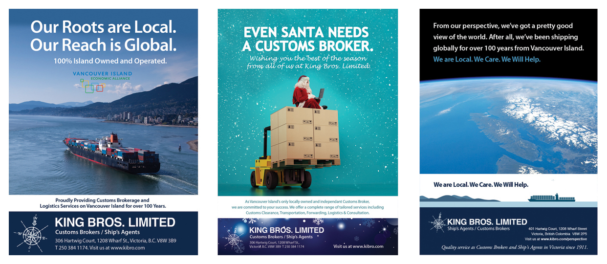
This year King Brothers asked me to come up with an ad for Christmas to run in the Business Examiner on Vancouver Island and after all we’ve all been through the past couple of years, I was pleased when he approved a lighthearted concept.
I’ve also included a couple of the other ads we’ve been doing over the years which I like…
King’s Sales Kit
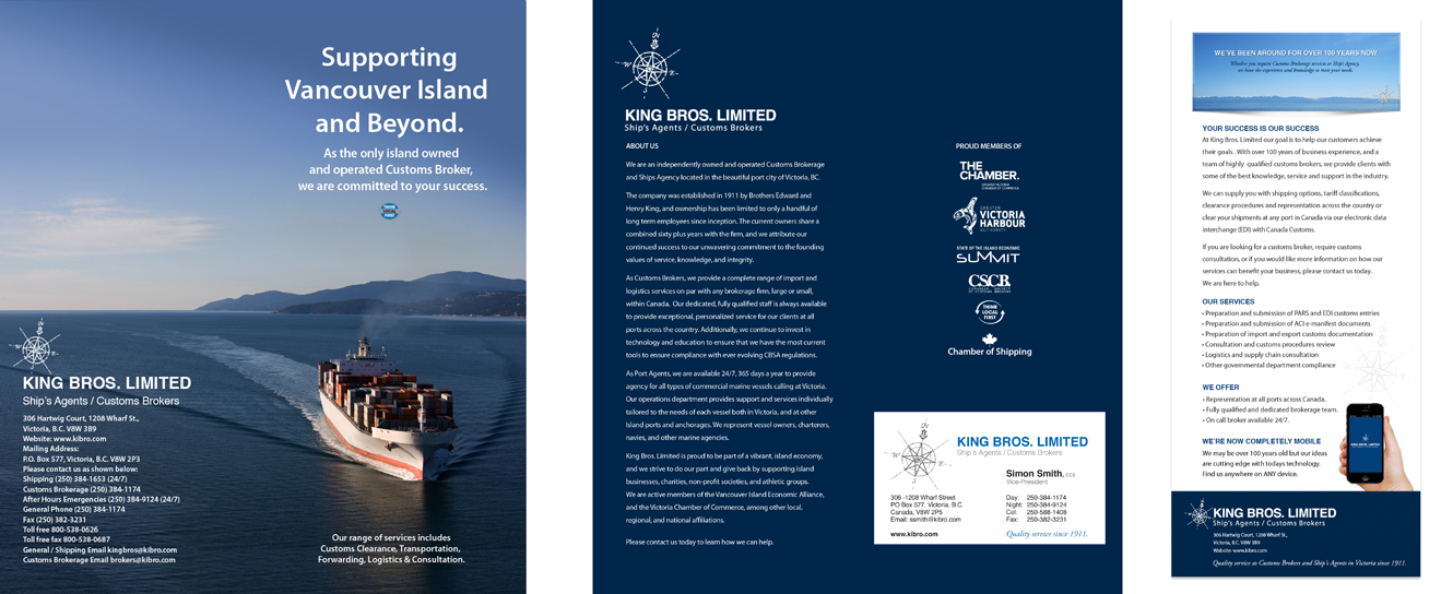
A few years back, I created a display booth for King brothers and a sales kit that they could hand out at shows. It’s a small kit, 4 1/4 x 9 inches which can fit inside a regular envelope also, and we created a series of inserts which fit inside a small pocket on the right on the folder. A nice little piece.
Landing Pages
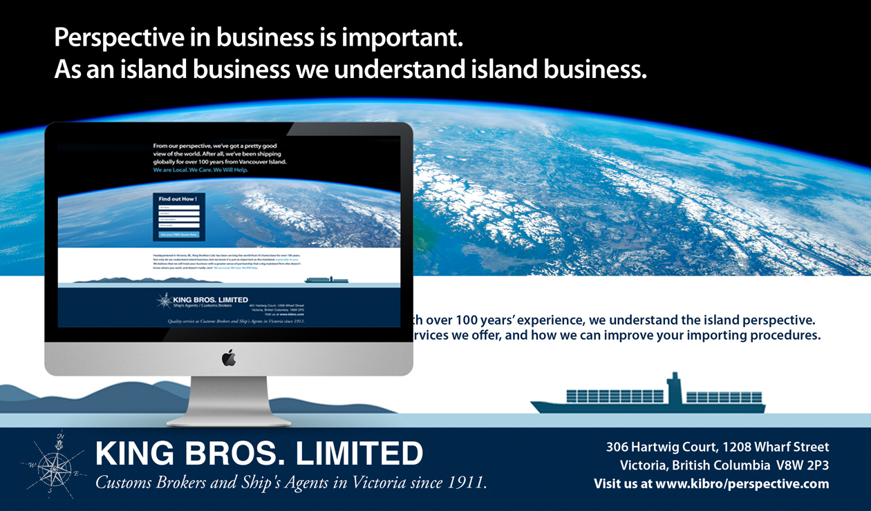
Over the years, we’ve created a series of landing pages directed at promoting the fact that King Brothers has more experience than any other firm globally doing business from Vancouver Island. Perspective in business is important. Landing pages lead customers to a specific product, service or offer and encourage them to take action. A web page allows you to capture a visitor’s information through a lead-capture form (AKA a conversion form). For this particular landing page, we wanted to tell customers how we are different, because we are an island based company…
The most essential element of a landing page is the CTA. A successful landing page should have one value proposition, one clear message, and one dominant Call To Action.
The most successful landing page CTAs are unmissable. The colour palette of a landing page can affect user interaction based on emotional and gender factors. But a likelier influence on user behavior than color scheme is “pop.” CTAs need to be isolated on the page with either white space or colour. Readability is also crucial. A CTA is ideally white text on a dark background—it converts more than dark text on a light background.
We wanted visitors to Sign up NOW to learn how we can help improve their import process. After all, we’ve been helping islanders for over 100 years.
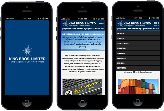
Responsive Design
People who browse while on-the-go have very different needs than those sitting at a desk. Responsive web sites re-organize themselves automatically according to the device viewing them, so that the same website provides a great experience everywhere.
A contemporary website must work effectively on all desktop browsers as well as the myriad of mobile devices available today. Responsive Design is the art of creating an architecture that works across all browsers and devices. Responsive Design tailors the implementation to provide the best quality online browsing experience – whether on a computer, smartphone, tablet, netbook or e-reader, and regardless of the operating system.
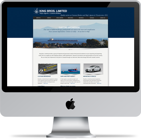
The 2013 Website. A big step forward.
At 100+ years old, King Brothers decided it was time for a complete re-branding and website overhaul. We were fortunate enough to have been working with them and had built their first small website and evolved it for them for the past eight years. Today, their website is a CMS Based, completely responsive, state of the art website with integrated shipment tracking.
- Responsive website design
- Custom CMS-focused development
- Search engine optimization
- Front-end development with HTML5
- Integrated Blog
- Advanced Social Media options.
E-Newsletters
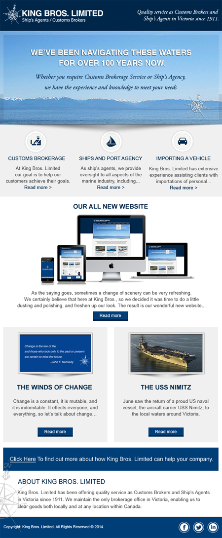
For many years, I believed that E-Newsletters were critical to an on-going marketing communications campaign and as such, created this beautifully well balanced newsletter for King Brothers but experience has shown me that social media has almost replaced this form of communications now.
Although for targeted marketing updates, there is a large percentage of the population not socially savvy as yet or open to receiving business updates on social media. That being said, the fundamentals of creating a useful newsletters are shown here.
A nice bold opening headline.
Three points, each linked to key services King Brothers offers.
A main story.
Two Blog Posts, linked into the newsletter to drive traffic to past or current blog posts, which may be of interest to a mailing list.
A nice sign off / contact us note.
Finished off with social media links.
Et Voila… my idea of a very nice effective E-Newsletter Design.
Online Tracking
One of the features built into this website is the ability to track a shipment on any mobile device. We thought this would be a great addition to the website for the simple reason that people are on the go and want to know where there package is at all times…
Sell Sheets
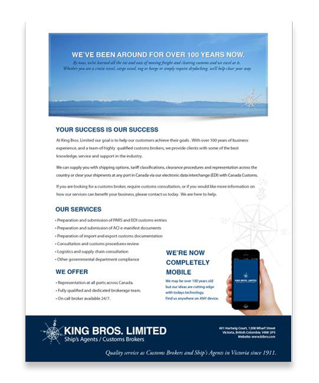
A sell sheet is a physical first impression. It captures the essence of a brand‘s identity and the product’s purpose. It is often distributed to prospects through the mail, via email, or at actual meetings. In King’s case, we created these for distribution at a Trade Show initially.
Sell sheets demonstrates a products’ capabilities and professionalism. Distributing informative, well-constructed sell sheets shows that a business has a lot to offer. It can help convince on-the-fence prospects to make a purchase and keep a business top-of-mind.
When I design a brand identity, I like everything to be consistent. Everything should look like it is in unison with the central values of a company.
As such, the sell sheets which King Brothers sends to potential clients when literature is requested follow the branding perfectly.
Photography
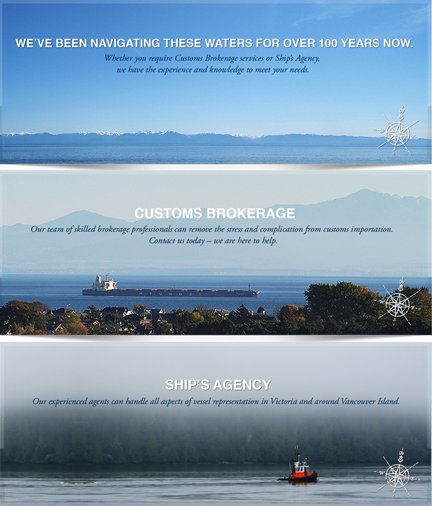
One of the benefits of working with me is I take a lot of the photography which appear in the websites I create for my clients, something most firms are not capable of… and we love seeing our photos online.
These three were taken in order along Dallas Road in downtown Victoria, then closer towards Oak Bay along the shoreline and lastly, coming down the inlet from Bamfield.
Working with King Brothers for the past 16 years has shown me what a great working relationship can be like. There’s never been any conflict along the way.
Now we are respected colleagues working with each other to achieve a common goal. We discuss challenges and potential solutions rationally and as friends.





No Comments